If you love a good before-and-after home tour, then you don’t want to miss this one. Reston resident Carolyn Reams sent me photos of her family’s renovations, and I was stunned by the transformation. She invited me to come in and see her beautiful house for one of Modern Reston’s home tours.
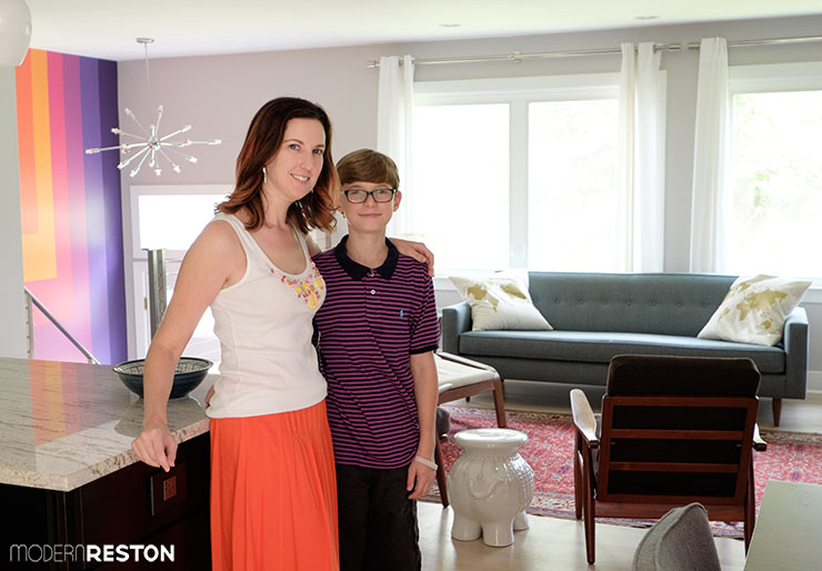
Reston resident Carolyn Reams and her son, George, in their newly renovated open plan living room and kitchen
Carolyn lives with her husband, Shawn, and son, George, in a 1976 split-foyer home in South Reston. They bought the house 12 years ago, when George was just a month old.
Two years ago they began renovations, starting with a hall bathroom on the main level. In 2014 they undertook a massive transformation of the main living area, opening the walls between the living room, dining room, and kitchen, to create a spacious, open floor plan. They also replaced most of their furniture and lighting, and completely updated the kitchen. The results are gorgeous.
BEFORE AND AFTER
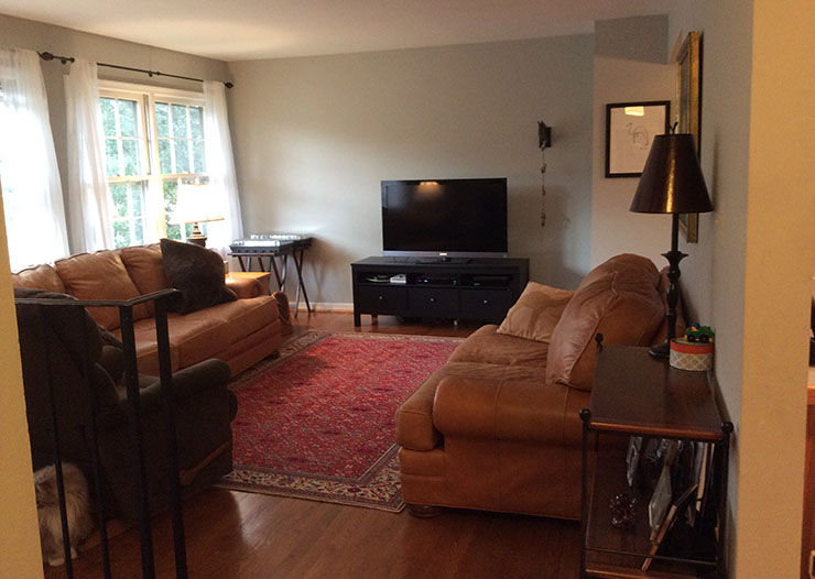
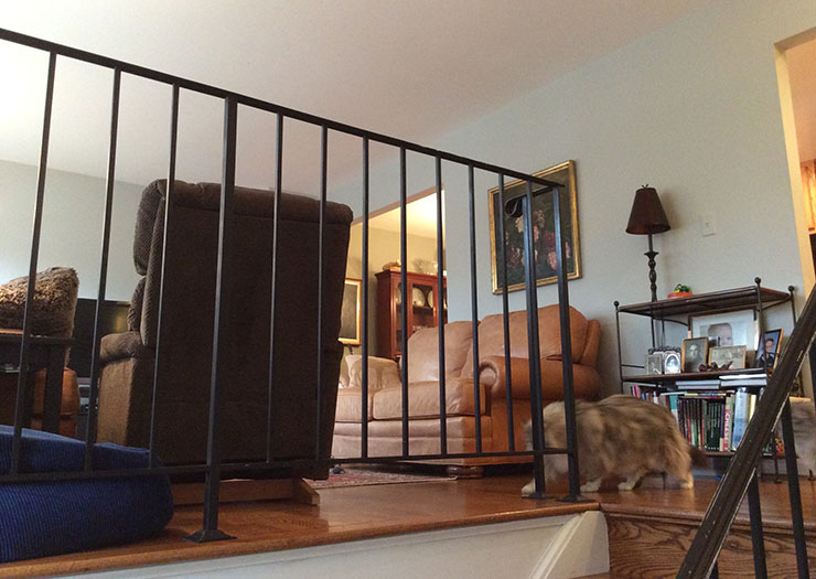
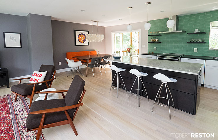
Before their renovations, a wall separated the living room from the kitchen and dining room. The living room was cramped, and the kitchen felt isolated. They discovered that the dividing wall was not load-bearing, so they had it removed to open the entire space. Today, the wall is gone and the living room feels much larger and brighter! They replaced most of the furniture with airier, contemporary and mid-century modern pieces.
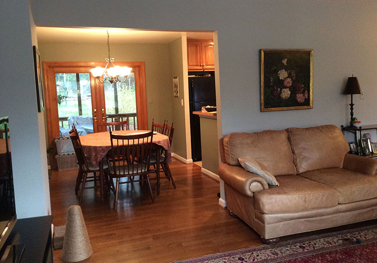
Before renovations, small doorways led from the living room to the dining room and kitchen, with a dividing wall between them. After the wall was removed, the kitchen, dining, and living rooms have become one large, sleek, stylish space.
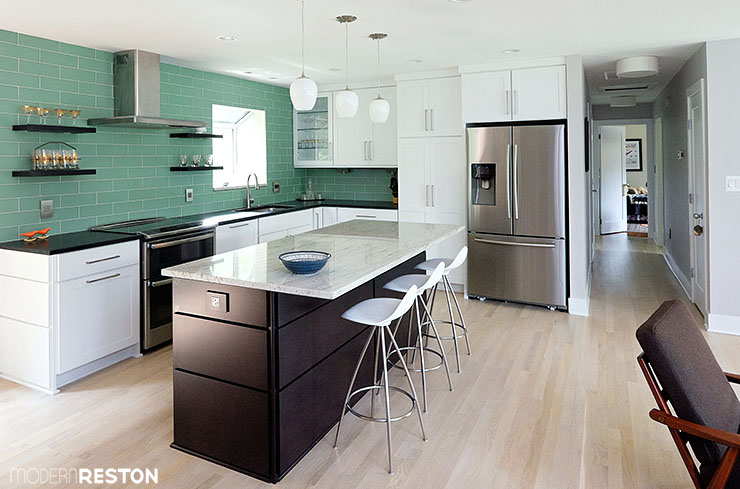
A glimpse beyond the original dividing wall shows the previous kitchen cabinets and dark appliances. The renovated kitchen now includes a granite-topped island, new white cabinets, stainless steel appliances, and a wall of aqua green glass tiles. They also replaced the flooring with lighter wood, as part of the process of lightening these dark spaces.
HOME TOUR
Do you want to learn more about these gorgeous changes and see some of the details? Carolyn showed me around their house and shared some of their decorating sources and inspiration.

My favorite element of the whole space greets you as you enter the front door. This vibrant mural was designed by Carolyn and her interior designer, Alexandra of Alexandra Design Finds. Carolyn is a fan of mid-century painters Gene Davis and Kenneth Noland, both of whom were known for colorful paintings of stripes and geometric shapes. She dreamed of having a large painting by one of them in her entryway, but was prohibited by cost. After encountering a colorful striped mural in Scottsdale Museum of Contemporary Art, Carolyn was inspired to create her own version at home. Carolyn used a Pinterest board to gather ideas for the paint colors. Alexandra wrote a post about this transformation on her design blog.
The rest of Carolyn’s main living area is decorated in neutrals and soft blues, which makes this accent wall particularly fun and unexpected. She carries some of the orange color into accents throughout the rest of the living space, to tie the elements together.
The original railing was made of black wrought iron. They replaced it with a stainless steel railing that was custom made by AGS Stainless in Seattle.

The other focal point of the entryway is a Sputnik light that was custom made by ModernArtifaxSputnik on Etsy.
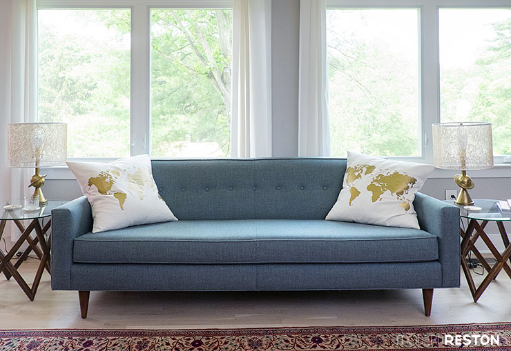
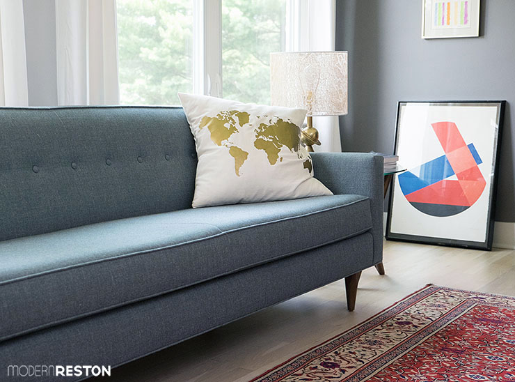
The living room sofa is a light blue Bantam by Design Within Reach, with tapered wood legs and a single row of tufting. A painting that Carolyn found in an online auction leans against the wall.
The rug is a 50-year-old Turkish dowry rug that Carolyn’s mother brought back after a visit to Turkey.
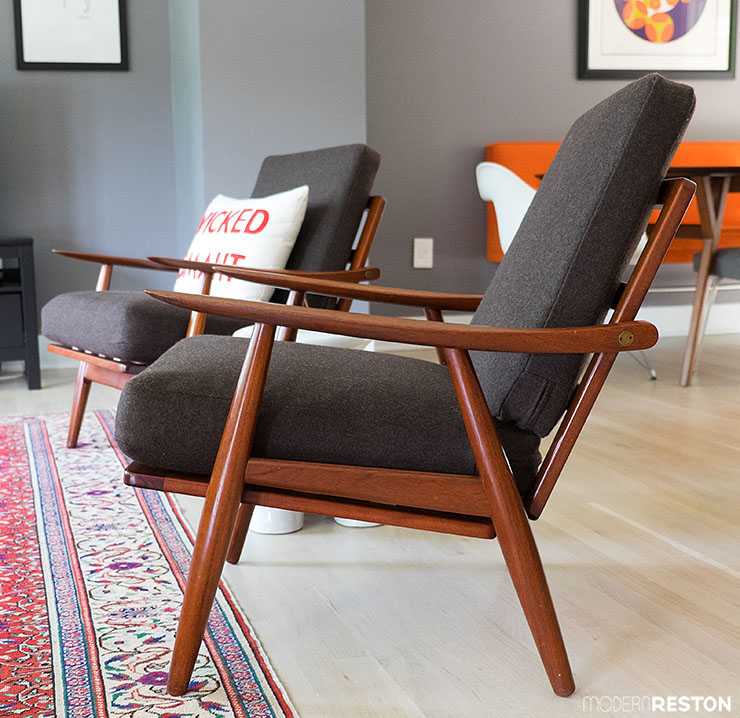
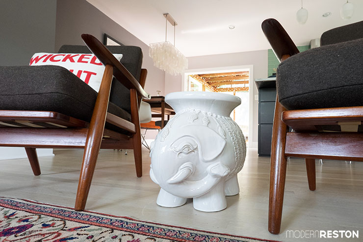
Carolyn’s favorite pieces of furniture in the room are two vintage Hans Wegner chairs that she found at Galaxie Modern in Lynchburg, Virginia. “I call them ‘vintage.’ My dad calls them ‘used,'” she joked. A playful elephant side table sits between the chairs and adds some whimsy and rounded contrast to the straight lines of the chairs.
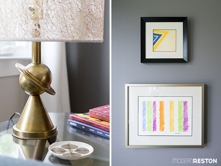
Two Saturn lamps from the 1920s sit on end tables in the living room. Carolyn found them on Etsy, and her husband Shawn, who is an electrical engineer, redid the wiring to make them functional.
The work of two of Carolyn’s favorite artists is displayed on the living room wall. The larger piece is a print by Gene Davis, and the smaller one is a framed postcard of a Kenneth Noland painting.
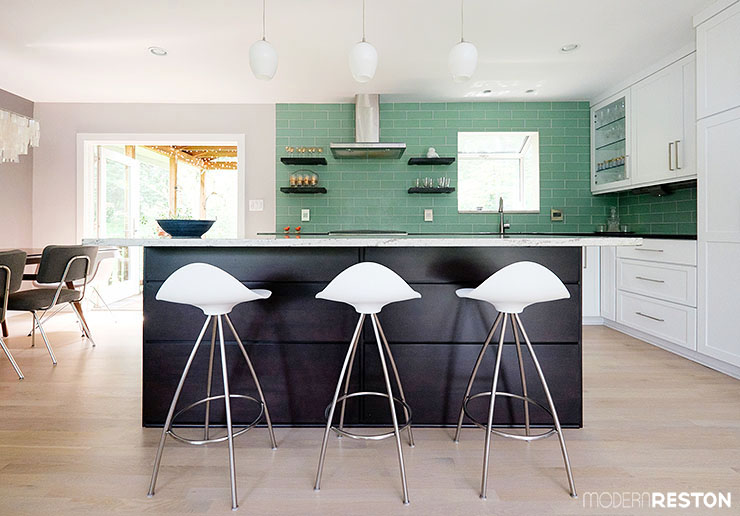
Facing the living room is the new kitchen island, made of dark wood and lined with three Onda barstools from Design Within Reach.
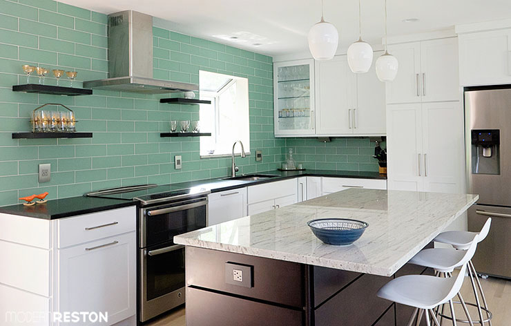
Shawn designed the kitchen himself, and they hired Sun Design to be the contractors who could bring his vision to life.
The kitchen has granite counters, with white and gray on the island, and black matte in the rest of the kitchen. Pendant lights from Home Depot hang above the island. A bowl that the family bought on a trip to Jordan is the only decoration on the uncluttered island.
The wall is decorated with glass subway tile in a glossy aqua color, which gives the room a bright yet calming feel. Carolyn has learned, though, that glass tile requires a lot of work to keep clean in a kitchen.
Open, floating shelves display mid-century glasses that she found on Etsy.
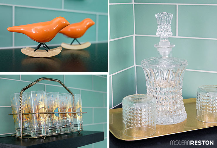
The kitchen is left uncluttered, with only carefully selected decorative items on display. A theme of orange, gold, and glass carries through most of the items.
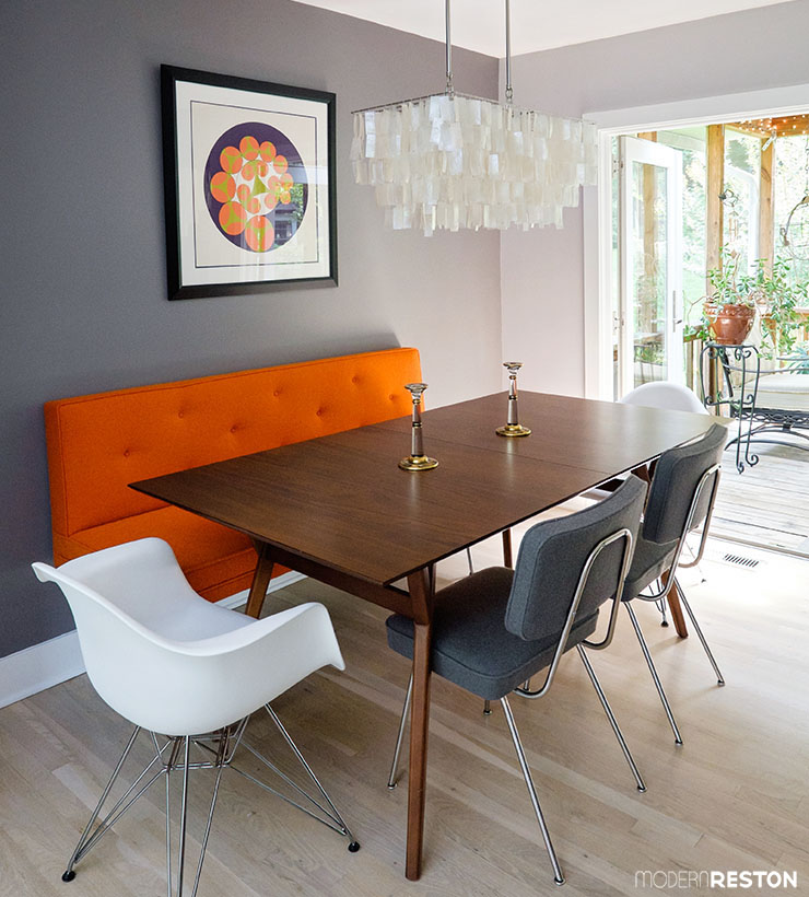
The dining room sits next to the kitchen, and continues with accents in orange, gold, and glass. The orange in the banquette and painting also tie in with the bright colors of the entry way mural, which sits diagonally across the space from the dining room.
The banquette was custom made by Daniel Donnelly, with the same kind of fabric used in the two gray Case Study dining chairs. White Eames armchairs with wire bases sit at the heads of the table. The dining table is the Mid-Century Expandable Table from West Elm.
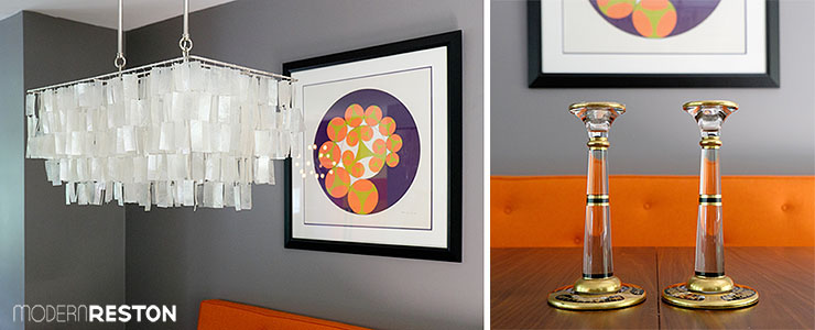
Hanging above the dining table is the Rectangle Capiz Chandelier from West Elm. They found the art in an online auction.
Two heirloom glass and brass candlesticks sit on the table. They belonged to Carolyn’s great-grandmother.
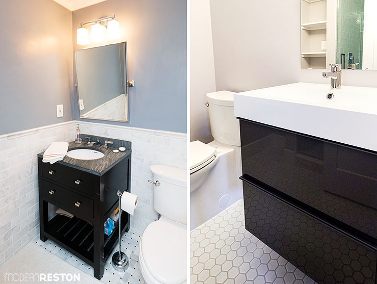
Carolyn and Shawn also renovated two hall bathrooms, one upstairs (seen above left), and one in the basement (above right).
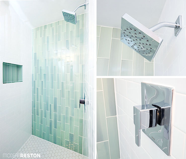
They added a very modern shower to the downstairs bathroom, with aqua green glass tiles, and stainless steel contemporary fixtures.
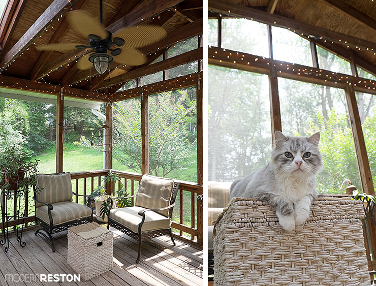
Another enviable room in the house is the fully screened-in porch, which sits directly off the dining room. I could have sat out there for hours, where the family’s cats were absorbing the summer warmth.

Many thanks to Carolyn, Shawn, George, and the cats for sharing their gorgeous home! It is such a wonderful source of inspiration and eye candy.
Do you have a great before-and-after story? Is your home beautiful, funky, stylish, elegant, quirky, or otherwise interesting? We are always looking for homes to feature, and we’d love to see pictures of yours. We welcome all styles of homes, from contemporary to antique, from custom to DIY, and everything in between. If you would like your house to be considered for a Modern Reston home tour or before-and-after story, please contact us with photos at [email protected].
Photo credit: Charlotte Geary
Related stories:
Home Tour: A Designer’s Vibrant Waterfront Townhouse
Home Tour: Basil’s Eclectic, Art-filled Condo
Before & After: A Dingy 1970s Bathroom Becomes Bright and Modern
Holiday Home Tour: The Wests’ Lush and Surprisingly Affordable Fall Decor
Holiday Home Tour: The Wests’ Incredible Halloween Decorations
Holiday Home Tour: Allison’s Classic Christmas Elegance
Know Before You Go: Shopping For Mid-Century Modern Furniture in the DMV

